Tuesday, September 29, 2009

Rusting Fabrics

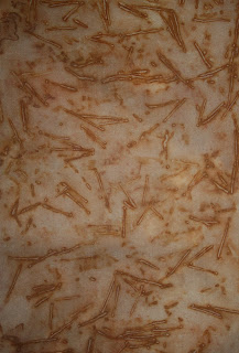
I've been experimenting lately with rusting fabrics ... this is great fun and you get the most amazing patterns.
I tried to be clever with some of the pieces, as I felt some of them were a bit "in your face" with the stark white/cream background against the orange rust, so I decided to immerse the fabrics in tea to tea-dye the background. The result wasn't what I expected .... instead a grey/brown fabric.

The tannins in the tea worked against the wonderful orange/gold colours of the rust. Although it changed the visual context completely, it left something quite different and unusual in its own right, even if it wasn't was I had hoped for. Isn't that usually the way?!

Not sure what I'll do with these samples yet, but one of the larger pieces pictured below will be used in my wall hanging.


Don't think hubbies got anything rusty left in his shed .... I've ransacked it, dragged out anything rusty, covered it in fabric and sprayed it with vinegar, oh well - he needed a clean up in his shed anyway!


Monday, September 21, 2009

Transparent Fabrics

After a harrowing few months I'm now back into the swing of it and madly trying to catch up on lost time, throwing myself whole-heartedly into Module 8 : Transparent Fabrics, More Machine Techniques and a Working Design for a 3D item.
I spent the day holed up in my studio painting papers with transfer paints and crayola transfer crayons. Managed to make up over 50 papers .... some will come in handy in the future.

I used everything that I could find that could be described as a stencil of some sort, to try and give me as much variety in the patterns, as possible. Some worked better than others, depending on the fabric they were transferred onto.

I found that voile and nets were great, but crystal organza's blurred and didn't take up the transfer very well.


The transfer paints were great for stamping, and gave much brighter colours than what appears on the paper.


Rubbing mats were good fun to use with the Crayola transfer crayons, and the designs could be cut up and re-arranged.

I even tried the scrapbooking wooden motifs as stamps and stencils, they worked fine!

A productive day .... lets hope tomorrow is as good.

Saturday, August 15, 2009

Trip to Melbourne

Well the past month has been a mixed bag with highs and lows.
I completed my Module 7 and submitted it for assessment. I got a good report back but have a bit of "tweeking" to do on my wall hanging, so hopefully next week should see me in a brighter frame of mind to tackle this.
I went over to Melbourne to visit hubby, who's working over there, and had a lovely week. Weather was cold and brisk, bringing back memories of England, but nice and refreshing.
I LOVED the architecture of Melbourne and went a bit snap happy.
It's such a lovely city with so much to see and photograph ... twice I was approached and asked if I was a professional photographer!!
Spent a morning at the Victoria Markets .... what a place! I could live in Melb just for the food and produce ... so much to choose from, good prices and all freshly picked.
We spent a day travelling through the Dandenong Ranges on the Puffing Billy train. Great experience ... even though it was an open sided train and the weather was only 6C!! Scenery was stunning ... would recommend it to anyone.
I spent days and days visiting art galleries and museums, and in the National Gallery of Victoria (International) I found an exhibition called "Persuasion : Fashion of the Age of Jane Austen". What a find!!!!! Beautiful costumes.
So all in all a great week in Melbourne, but came home and had my feet kicked out from under me when I came down with swine flu. I was very ill for 10 days and just as I was starting to pick myself up we were then knocked down again by the passing of a very good and dear friend.
Highs and lows .... such is life.

Tuesday, June 30, 2009

More of Module 5 & bits and pieces

I'm still busy plodding along with the wall hanging samples and trying to put together my Module 7 submission, and have nothing of note to post at the moment, so I thought I'd include a few other snippets from the course as well as my own hand embroidery.
Part of our Module 5 submission was to present our work in a 3D format. We were given ideas of using: a wine rack; a mobile; a box format etc. I didn't want to go down the track of something the tutor had suggested and wanted to come up with an idea that was completely my own. As usual it took a few weeks for the cogs in my brain to start working, then one day I spotted a little caboose in a magazine and WHAM! the idea was planted.
I built a cardboard and paper mache train and caboose to hold my research and design pieces in, like a moving filing cabinet, and called it the "City and Guild Express". It took me a long time to work out the size to a scale that would enable the caboose to hold A4 sized documents in a landscape format, and I had to mock up loads of paper samples before I started on cardboard.
As usual with anything that I do, it took me AGES to finish it, but I was really chuffed with the end result. The wheels are wooden teddy bear making joints fixed with split pins and actually move as you push the train.
It has so many layers of paper glued to it, along with paint and varnish, that its really quite sturdy. My tutor replied by saying that there's not a lot of submissions that make her smile, but this did!
It now sits with pride in my work studio and will one day be handed over to my grandson to put his toys in, and no doubt destroy, as only little boys can do!
I also thought I'd show a few gift tags I've been steadily making over the past year or so. I thought they'd be nice to give to special family and friends, and also for labeling jars of buttons, ribbons, pins etc. Here are a few examples. I've sold a few through a local gift shop .... do you think if I put them on Etsy anyone would be interested?


Friday, June 19, 2009

Colouring & Dyeing - More of Module 7

A requirement of this module was to colour and dye your own selection of fabrics using whatever mediums were available to you.
The only fabric dyeing I'd ever done before had been years ago at a 2 day workshop where we discovered after 2 exhaustive days that the dye powders were past their use-by date and effectively "off" .... and so I went home armed with an assortment of fabrics and threads you could only describe as the colour of dog diarrhoea. Hence I'd never bothered to try it again ... but C&G called, and I had to bite the bullet and have a go - on my own!
I started with the stock standard Dylon cold water dyes. I bought the 3 primary colours, then divided them up to create the secondary and tertiary colours.
It was a mammoth job to calculate the dye, water and fabric volumes and I've possibly gone wrong somewhere because the tertiary colours didn't work out as I'd expected. Instead of a lovely purple I got a plummy-brown and so on, but it was a good lesson.
Above and below are a few of my sample sheets.


I then attempted silk painting. I say attempted because it was my first go at this technique, and although I'm quite pleased with it, I recognise that I've a lot of improving to do.
I used a silk habutai scarf, secured in an embroidery clip frame, and drew the design using clear gutta for the outline of the daisies, and black gutter for the seeds.
The design was filled in using Setasilk paints in buttercup, iris violet, meadow green, raspberry and azur blue.

After I'd filled in the daisies, it looked a bit stark, so I watered down the background fabric, and splodged the silk paints on it, so that they would blend. I then added a few dots of gold Lumiere paint as highlights.

Overall not a bad first attempt. A bit fiddly, but I still think I'd try it again.
Next challenge was to try transfer printing using liquid disperse dyes. I only had three colours: tomatoe, skye and leaf, so my design scope was a bit limited. I draw this bunch of roses and hoped for the best .... and was pleasantly surprised. It worked brilliantly and the colours on the fabric (polyester satin) came up much brighter than on the paper print. Great fun and easy to do.
I was disappointed with the Dylon fabric dyeing, so had a go at using Procion dyes. These were much more successful and I got a lovely range of hues and tones. To create the purple colour scheme I mixed Navy, Fuchsia and Cobalt Blue.


and for the lime green scheme, I mixed Cobalt Blue with Lemon Yellow.

The colours are lovely and not as mottled as the Dylon attempt. I liked using the procion dyes, even though it was a bit painful and frustrating making up the soda ash and salt mixes.
Apart from dyes we were also required to use paints, crayons, felt pens, etc. I liked the Shiva sticks, especially using a stencil or rubbing over a stamp. Easy and quick.
Crayola fabric transfer crayons were also good fun and easy to use.
I love the Luminarte Mini Twinklers watercolour paints and they give a nice shimmer to the fabric but can make it a bit stiff, as it did on the cotton fabric. On the polyester fabric I sprayed water onto the fabric first, then splodged (technical term again!) the paints
haphazardly and the fabric remained quite soft and fluid. My last sample is a salt dry effect using Dya-na-flow on a polyester satin fabric. This was easy to do and created a great effect, although DH thinks it looks like hundreds of penguins.
Dyeing was time consuming and put me out of my comfort zone, but I like the idea of making my own coloured fabrics and will probably continue with it, but just need to build up my stock of dyes and paints (roll on Lotto night!!!!).

Sunday, June 14, 2009

Module 7 - City and Guilds

I'm currently working on this module, and nearly finished (even though I've been "nearly" finished for the past 6 weeks!). This module is furthering our colour theory and submitting our working design for a wall hanging.
I like colour, and I'd like to think I understand colour - to a point, but I swear you could do a 4 year uni degree trying to fully understand it all .... its like trying to understand the universe.
Here's a sheet I did on simultaneous contrast using different tones and hues of green (do you have any idea how long it took me to cut out all the different greens from magazines!?)Then it was onto simultaneous contrast using the three primary colours and their complementarys.
I also prepared simultaneous contrast sheets for the three primary and three secondary colours, using patterned backgrounds. I've only shown the blue/orange one here .... didn't want to send you to sleep.

This is using a black patterned background for the 3 primary and 3 secondary colours, and I was starting to go a bit bozz-eyed by the end of the day.
I did a number of examples of warm and cool colour schemes too, here's one example.

We are also required to submit examples of hues: I chose blue through to yellow.
Using green as my chosen colour, I then did an example of chroma, from bright to dull.
I have to submit my working design for a wall hanging and must incorporate my Anglo Saxon/Viking designs along with my colour theory as well as using manipulated fabric ... and have been struggling to bring it all together.
So far I've worked a small sample of hand stitching a Viking design using metallic gold threads and purple silk threads. The photo below is the actual sample piece, and the one beneath that is the same piece but photographed without a flash ... creating an image that I really like. Somehow it appears more magical ...

Of course, after originally thinking I'd do the design in blues/purples/golds and black, I've now changed my mind and decided on a completely different colour scheme ... stayed tuned for that one!
For the manipulated fabric I've had another attempt to create the A/Saxon cross, and this time have created it using layers of muslin soaked in a diluted PVA glue solution and moulded around my felt cross mould. I like this better than the paper piece, and think it will paint up easier. I've yet to try the painting .... that's tomorrow's chore!

I'd also like to take this opportunity to thank Helen, Karen, Jane and Anne for chatting to me and sharing your C&G experiences .... I really needed it and appreciate you all taking the time to chat to me. It was the encouragement I needed to pick me up and stop me feeling like I was treading water, so many thanks once again.